Welcome to your all-new Official Charts - take a look around!
Discover a brand-new, immersive Official Charts experience for 2023

Taylor Swift's not the only one to usher in a new era, you know?
You may have noticed things look rather different around here today. Behind-the-scenes, we’ve been working hard to bring you a brand-new-and-improved Official Charts experience. Housed here, on your new OfficialCharts.com, we’re so excited to present the biggest and best Official Charts platform ever.
Firstly, yes, we have had a spruce-up. Thanks for noticing.
Bidding a fond farewell to our old branding, we thought it was about time we gave ourselves a glow-up. Honouring the iconic Number 1 Award in our reimagined logo, we’re still your 100% official, trusted and verified music source under a snazzy new guise. What do you reckon?
So, allow us to show you around.

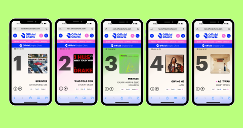
On our all-new Charts pages, you’re getting the most immersive experience we’ve ever offered. Switching between our traditional chart list view and music player mode, you can now listen to clips of the chart as you go; all within a slick new interface.
Press play and scroll through the chart from any week in Official Charts history. Now with enriched audio and video clips, tap the info button to discover facts and track the week-by-week chart journey of any song or album.
Let us introduce you to a brand-new international chart addition, too.
You can now also keep an eye on the French Albums Chart and French Singles Chart, compiled by the Official Charts Company, as well as enjoying the Official Irish Charts and – with kind permission – the USA’s Billboard Singles and Albums Charts.
Visit your brand-new Charts pages here and get lost in music!

Now, let’s talk about the database.
Our Artists section has doubled in size, serving you a never-before-seen view of the chart stats of over 50,000 artists.
Whether it’s the global icons of the Official Singles Chart or more niche acts enjoying Vinyl, Classical or Afrobeats Chart success, you’ll find a dedicated page for every charted artist in Official Charts history on our new platform.
Moreover, artist pages now contain at-a-glance information on specialist chart appearances for the first time ever. A treasure trove for super fans and chart nerds alike.
Give our all-new Artists section a test drive here.
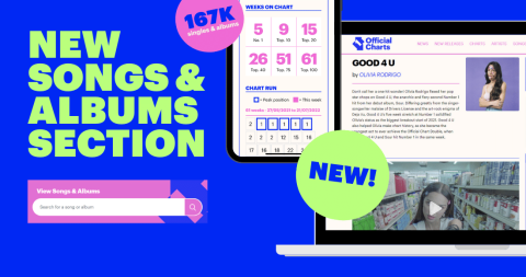
We’re also bringing you brand-new Song & Albums search functionality, allowing you to plug in any song or album to find out its full UK chart history. With a search of over 88,000 singles and 79,000 albums (that’s 167,000 new product pages), get lost in music as you uncover infinite new chart stats.

The deepest chart information resource ever, we’ve still got lots more exciting enhancements up our sleeves and ready to roll out this year. Watch this space!
So, take a look around and let us know how you're finding your all-new OfficialCharts.com. Please send your thoughts to feedback@officialcharts.com, we'd love to hear from you!
Join the conversation by joining the Official Charts community and dropping comment.
Already registered?
Log in
No account?
Register
O
Oldiesmann
There wasn't anything wrong with the previous design. I get that things need to be updated from time to time but this is horrendous - especially with the bright pink everywhere. Please fire whoever came up with this idea and go back to the drawing board. Look at Billboard, Ultratop or Offizielle Charts and you'll see modern sites that are easy to navigate and easy on the eyes.
D
DGH69
New design is awful. Everything is so large and you have to scroll up and down so much to see all the info. Someone has obviously tried to design it for mobile devices, rather than a desktop PC, but even on mobile the site is terrible. Looks like a child did it in 5 minutes!
Z
ZestyLemon
Things must move forward and additional features have to be welcomed, BUT I am not a fan of the chart page with its large numerical characters and harder to understand last week / high position stats. Agree with other comments re historical pages - they are just harder to navigate. Seems like this is catering for the younger generation only!!!
AA
Alistair Armour
How do you access the archives from 50 or 55 years ago. I used them on a weekly basis and the previous version was easy to navigate. This version isn't
Official Charts
Hi Alistair, you can still do that. If you're on desktop the quickest way in is via the 'Access The Archive box in the sidebar, but you can also go in via the magnifying glass search, or head on into the chart section itself and search any chart by date.
W
Wilson
This new look is awful!! Please please give us back the previous version. Who designed this? Get rid of them. Much too complicated and difficult to navigate. Too cluttered as well.
itsnoodleszn_
the new site will take some getting used to but it’ll be a lot of fun entering a new era of occ! especially looking forward to browsing the new charts <3
itsnoodleszn_
the new site will take some getting used to but it’ll be a lot of fun entering a new era of occ! especially looking forward to browsing the new charts <3
@
@TimisD
I really like the new site! Well done! I think it was about time for this! I know it might need some improvements but in all, it's wonderful!!
Official Charts
Thank you, that's great to hear. We think so too! Yes, plenty of tweaks to make still, and lots more enhancements and new additions to come too. An exciting fresh start!
A
alternativerob
Am I missing something? How do you access an archive chart directly using the calendar box? Say I want to look up the Album chart for 29th June 1975. I used to be able to type that date into the box in the old site and it would immediately display the relevant chart for that week. Now a pop up calendar appears and you can't overwrite it, at least not on my android tablet. The only way seems to be to scroll back month by month through 48 years!.
Please explain what I'm doing wrong.
Shoogle
Sorry, not a fan of the new look. There's too much crammed onto one screen, making it hard to navigate, and it's really slow to load. Can't even log in half the time. I don't like that I have to scroll through eight years of comments to get to the most recent ones either. Think I will just be checking in twice a week now (for midweeks and charts), instead of every day as I did before.